Targeting a new audience, standing out among competitors, improving communication with customers, and getting rid of a negative association, are just some reasons for rebranding.
74% of companies decide to rebrand their business in the first seven years. It includes marketing activities like, changing positioning, logo, brand name, launching targeted ads or conversational chatbot.
💡 Read Creating a Marketing Strategy that Works: Benefits, Steps, Tools
As a result, you can get millions of revenue and new customers like it was with Airbnb or Dunkin’. But there are also MasterCard, Royal Mail, and Pepsi stories with the opposite effect.
Rebranding requires deep research and inspiration. That’s precisely what you’ll find in this article — enjoy seven brilliant examples of rebranding successes and failures.
4 successful brand relaunch examples
What makes rebranding successful? Positive brand perception by a target audience? Design? Revenue?
Absolutely.
But the main secret is a deep understanding of an intended audience. And here are four brands that did it on the best possible level.
Energizer
If you’ve ever used tools like Tetris, remote TV control, or torchlight, you definitely know Energizer Bunny. Since the 1890s, this battery manufacturer has been a symbol of long-lasting power. Despite its mature age, the brand is still relevant.
The reason for a change
Unfortunately, the high quality of the product isn’t a guarantee that it can stand out against competitors. Especially when more and more famous names like Duracell, Alkaline, Panasonic, etc., with the same red, black, and copper design appear on the market. Since most customers chose batteries by their packaging color, Energizer tended to get lost among competitors and lose its fans.
So the brand decided to change batteries design ultimately.
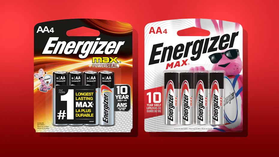
The solution — bright packaging
The task was to be visible on the product shelf. So designers changed the black packaging background to white to enhance the contrast of the blue, green, and red highlight colors.
There was one more element they changed to catch customers’ eyes — the size of Mr. Energizer. The small icon of the pink bunny on the batteries packaging background turned into the main star of the brand.
Energizer Bunny™ – Fluffy Tail
Since this change, a drummer and its fluffy little tail have occupied every ad, banner, or poster Energizer has done.
The result
There is no chance you’ll confuse pink Mr. Energizer on the white background with other dark-colored batteries. This story serves as a reminder that time and competition spare no one, not even those who have been in the market for a long time. Never stop monitoring the market to stay ahead of the newcomers trying to copy you.
Airbnb’s logo and positioning update
Founded in 2012, this company became a great alternative to hotels. This online vacation rental platform has become a game-changer in the hotel industry. By renting a house or an apartment from local homeowners, for some time, tourists can feel what it means to live like an actual Greek, Italian, etc. This is a unique experience that is impossible to get in a hotel.
But, of course, it was not always like that.
The reason for a change
No matter how convenient were hosts’ apartments, Airbnb was only a cheaper alternative to hotels. With this brand image, the company gardened a 200k increase in listings. That is a good result. But the price isn’t the best value to compete on the market for a long time.
The solution
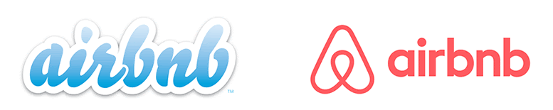
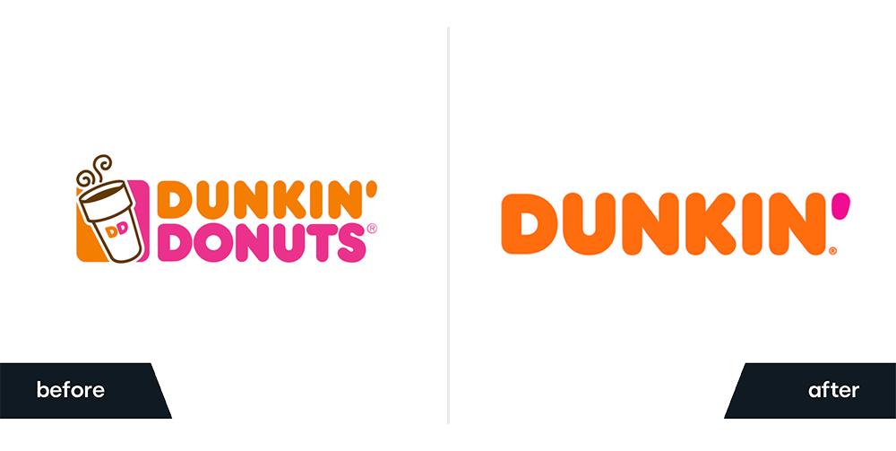
To stand out among competitors, Airbnb highlighted its new value — a unique traveling experience of becoming a part of the place you visit and becoming a local for some time. The company stated its goal as “Making a world where everyone can belong anywhere” and began by updating its logo. Here is the old and new version:
This idea was implemented in symbols of people, places, love, and the first letter of the company title.
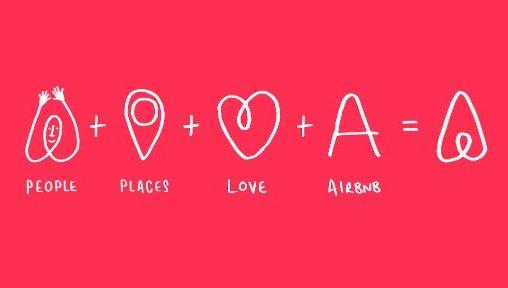
The Belo (short version of beloning) logo got a lot of criticism, like “it is a copy of Azuma Drive-in and Automation Anywhere” or “it looks like a woman’s genitalia.” Airbnb’s marketers should have conducted better logo research to avoid confusion with other brands. Good to know, Automation Anywhere didn’t see a problem in this case.
The next step to the new positioning implementation was website design change.
Previously, Arbnb’s app had a simple list-like design:
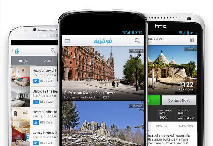
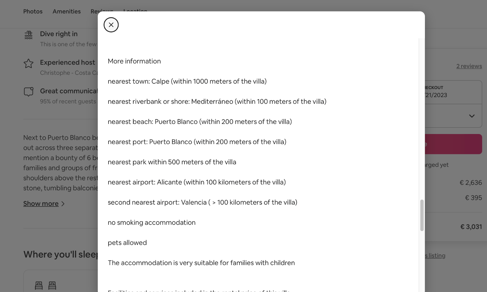
Now the focus shifted to storytelling. In addition to captivating photos of the house, you can see a list of attractions and info about local culture.
The result
Sure thing, it was a success. From three guests in 2007, Airbnb has grown to over 900 million users.
Dunkin’
Established in 1950, Dunkin’ Donuts is a global quick service from Massachusetts named after one of its bestsellers. With over 11k locations globally, it is known for its wide range of tea, coffee, and baked goods choice like sandwiches, bagels, and, sure thing, donuts.
The reason for the change
Rise of competitors like Tim Hortons, Starbucks, and McDonald’s. For example, competing with Starbucks with its ever-changing menu or Tim Hortons with its low prices was hard.
The solution
After a deep monitoring of its current customers and desired young audience, the 70-year-old brand decided to update the menu and image to something more modern. That required bold moves.
Dunkin’ messaging, pink and orange logo colors, bold font, and imagery fit all ages — no need to implement significant changes.
Which cannot be said about their menu. It didn’t match millennials’ healthy preferences in food. Thus, Dunkin’s menu saw fruit smoothies, oatmeal bowls, gluten-free, and vegan items.
The bright example of the last one became a meatless sausage breakfast sandwich ㅡ, the result of a partnership with Beyond Meat. It brought a lot of attention and customers to both companies.
One more healthy change in the menu was shifting from baked goods to coffee, tea, and other drinks. They removed a donut part from the company name to eliminate the association with an unhealthy treat. Now it is simply Dunkin’:

The result
By putting customers’ interests first, Dunkin’ became a great example of a smooth transition to a new image of a healthy brand. It’s impossible for a new customer to mistake it for a donut-only specialty brand.
Five years after an update, we still see its name alongside world giants like Starbucks, McDonald’s, etc.
Stella Artois
This world-known beer brand has been a long story since 1336. It was trendy among Europeans due to its limited edition for Christmas and fresh ingredients. After a “Reassuringly Expensive” marketing campaign in 1981 brand achieved an image of a pricy, sophisticated, high-class drink.
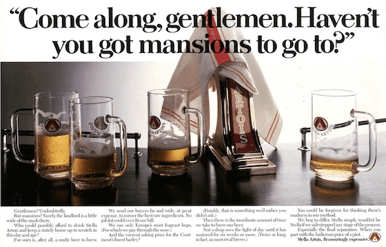
The reason for a change
Two dangerous moments were threatening the brand image:
- Since Stella Artois was a beer with a high percentage of alcohol, it became popular among football fans. These guys are known for binge drinking and violence. This association extended to Stella Artois and made it a reason for alcohol-induced violence.
- When the beer appeared on supermarket shelves, it got heavy discount labels. Thus, the pricy sophisticated drink turned into just another cheap beer.
The solution
- The first step to battling binge drinking was the launch of a lager with a lower percentage of alcohol.
- To recover its sophisticated brand reputation, the beer company launched a “thing of beauty” campaign. It was a guide on how to pour the perfect pint of Stella. In such a way brand highlighted that customers need special skills to consume this product.
- Another element of the high-class drink image became a coat of arms and a chalice on a new logo:
The result
It worked. This beer is still prevalent worldwide and belongs to a “sophisticated” class of drinks. Moreover, in 2013 it was recognized as “the best premium lager” by the Morning Advertiser.
3 examples of howling waste of money on rebranding
Rebranding is a pricy campaign, especially when you did it wrong. There are three quick examples to learn from.
Mastercard
This financial company is a market leader, easily recognizable by its logo of merged circles. In 2006, they updated their design to align with those days’ trends by adding gradients, shadows, and a third circle.

The result
The iconic logo turned into a mess. Sure thing, clients were confused. The only thing giving them brand association is the company name under it. Sure thing, the company continued using the old and new logo versions. The last was used for worldwide communications.
That is how MasterCard wasted $1.5 million on rebranding.
Pepsi
It seems like this soda drink has never-ending identity issues. Pepsi marketers enjoy changing the company logo. For example, an update from 2008, when a middle wavy stripe turned into a “cheeky smile.” Depending on the product, it was thinner or wider.
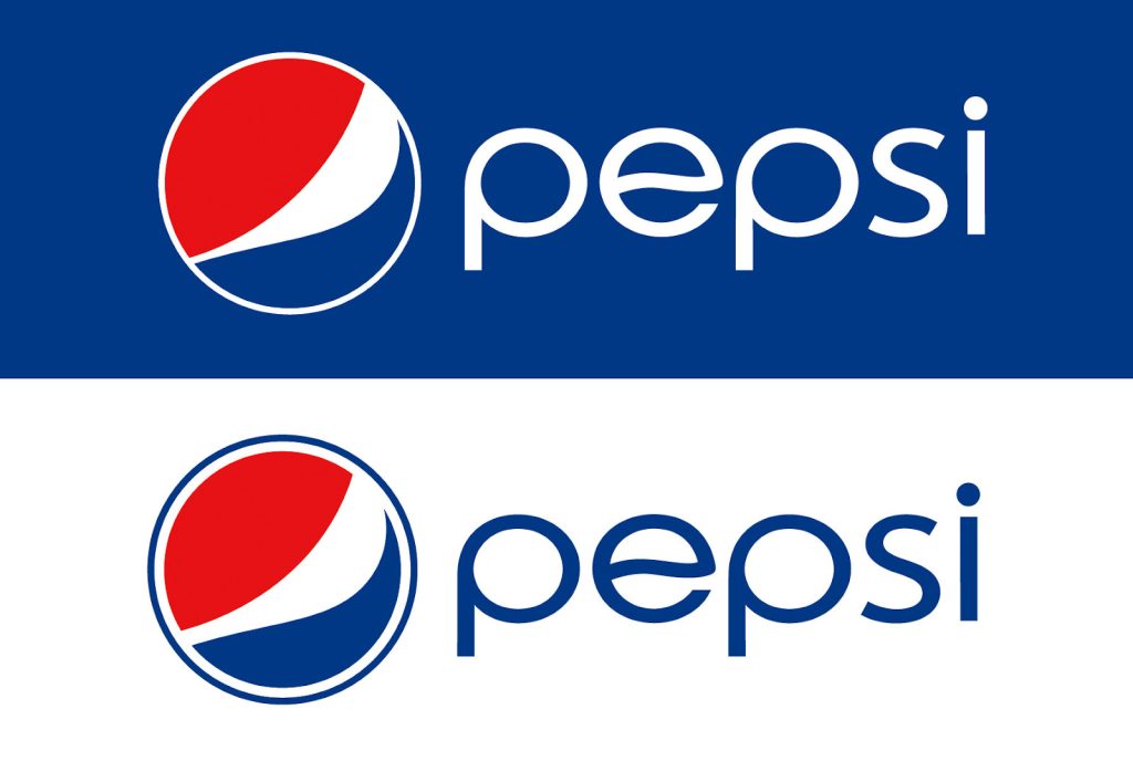
It should have been identified as a smile. But it didn’t.
This is a great example of a poorly conducted design test before launching an idea. People didn’t understand the change or the smile idea.
The result – confused customers and a waste of $1 million. Yes, Pepsi paid $1 million for this small change.
Royal Mail

This is the story of the biggest UK mail carrier. In 2001 they shocked clients with a new logo, design, and company name — Consignia.
In theory, the word “consign” perfectly fits the mail carrier brand. It means:
- to send something to someone;
- to deliver for sale or custody;
- to entrust;
- to set apart, assign.
But that wasn’t enough to make it work in practice.
The result
Clients found this name too fussy. Moreover, it is hard to pronounce. Several newspapers referred to it as a “Spelling Fiasco.”
Thus, a year after a change, Consignia left the market, and happy clients saw a good old name — Royal Mail.
People forgave and forgot about that episode. The only thing that reminds them about Consignia is articles like this. What can’t be said about the brand — try to ignore the £1.5 million (the price of this rebranding campaign) thrown to the wind.
To summarize
What is the main lesson of these stories? Any rebranding change requires a deep understanding of your audience first. It shouldn’t be just a company’s desire to change something just because it is time to.
The first question marketers should answer building any strategy is — Who are we trying to reach? Are we managing it? Rebranding is not something that should be taken lightly. Always conduct good deep research before diving in.


